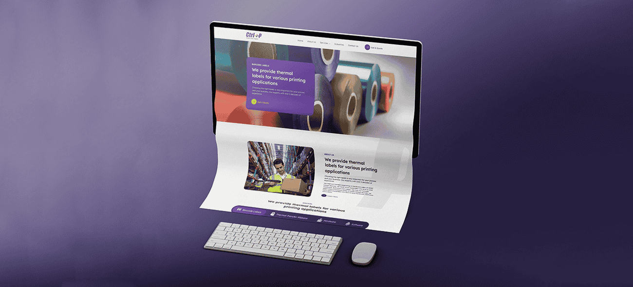
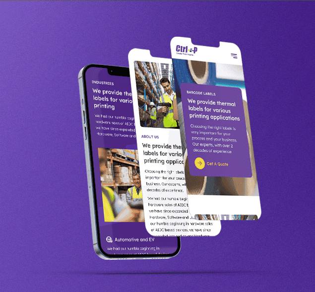
Creative Web Design For ControlP
Problems
A newly established labelling company encountered hurdles related to brand recognition, credibility, and differentiation. The fundamental problem they faced was the need to establish themselves as a reliable and capable partner for the bigger companies they targeted.
Challenge
The central challenge for this emerging labelling company was to create a positive and compelling image that would resonate with larger enterprises.
When dealing with prominent corporations, trust and professionalism are of paramount importance. Building a reputation that instilled confidence and reliability was essential to winning the trust of potential clients in the corporate sector.
Solution
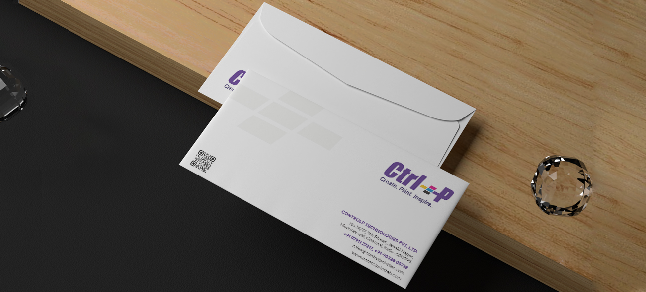
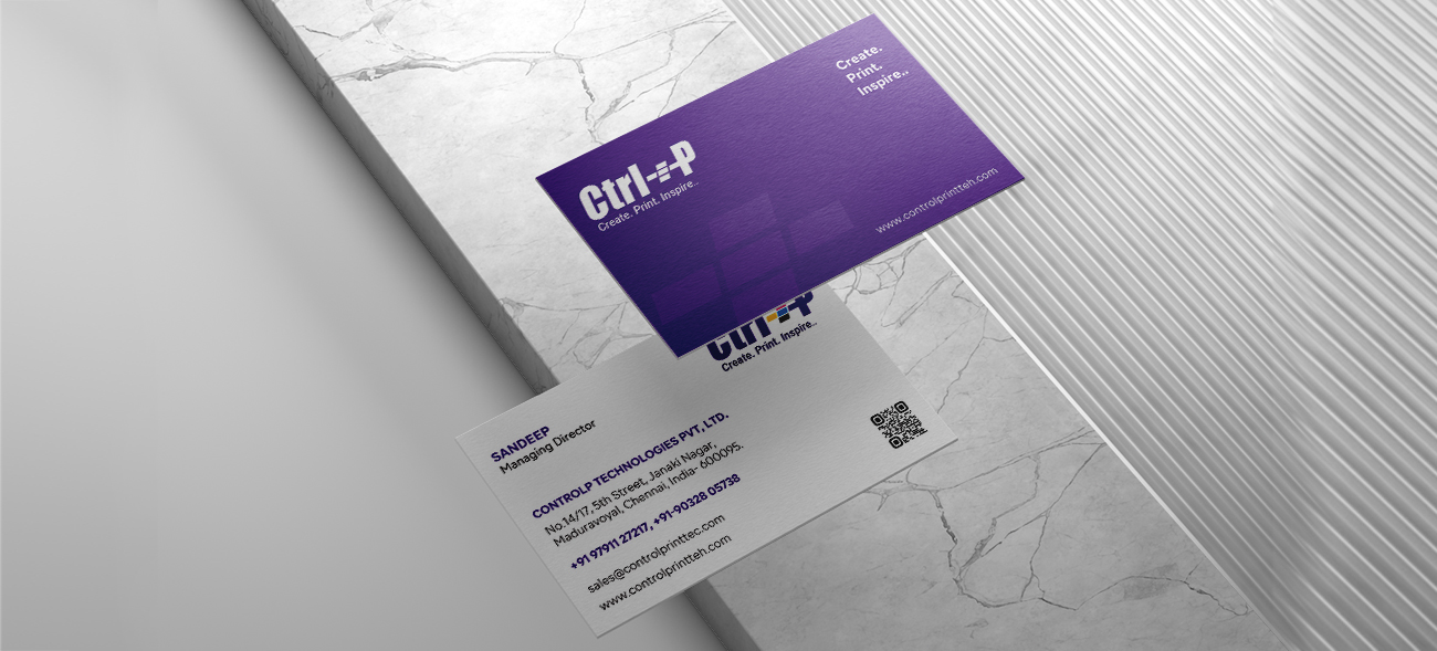
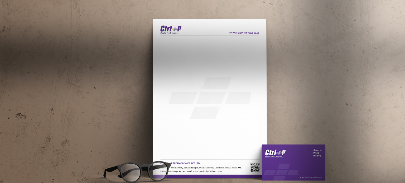
The name "Ctrl+P" was thoughtfully derived from the widely recognized keyboard shortcut for printing documents, Ctrl+P, showcasing a creative and ingenious approach to branding.
We opted for CMYK colors, a choice that was both practical and symbolic. CMYK represents the four primary printing ink colors – Cyan, Magenta, Yellow, and Key (black). This choice was not only relevant but also reinforced the brand's association with printing and efficiency.
